Assumptions of correlation coefficient, normality,
homoscedasticity
An
inspection of a scatterplot can give an impression of whether two variables
are related and the direction of their relationship. But it alone is not sufficient
to determine whether there is an association between two variables. The relationship
depicted in the scatterplot needs to be described qualitatively. Descriptive
statistics that express the degree of relation between two variables are called
correlation coefficients. A commonly employed correlation coefficient
for scores at the interval or ratio level of measurement is the Pearson
product-moment correlation coefficient, or PearsonÆs r.
The
Pearson's r is a descriptive statistic that describes the linear relationship
between two or more variables, each measured for the same collection of individuals. An "individual" is not necessarily a person: it might be an automobile, a
place, a family, a university, etc. For example, the two variables might be the heights of a man and of his son; there, the
"individual" is the pair (father, son). Such pairs of measurements are called bivariate data. Observations of two or more
variables per individual in general are called multivariate data. As with any sample of scores, the sample
is drawn from a larger population of scores.
The
test for significance of Pearson's r assumes that a particular variable, X and
another variable, Y, form a bivariate
normal distribution in the population. A bivariate normal distribution
possesses the following characteristics:
À
The
distribution of the X scores is normally distributed in the population
sampled.
À
The
distribution of the Y scores is normally distributed in the population
sampled.
À
For
each X score, the distribution of Y scores in the population is normal.
À
For
each Y score, the distribution of Y scores in the population is normal.
Assumption 1: The correlation coefficient
r assumes that the two variables measured
form a bivariate normal distribution population.
Describing Scatterplots
One of the best tools for studying the association of two variables visually is the scatterplot or scatter diagram. It is especially
helpful when the number of data is large---studying a list is then virtually hopeless. A scatterplot plots two measured variables
against each other, for each individual. That is, the "x" (horizontal) coordinate of a point in a scatterplot is the value of one
measurement of an individual, and the "y" (vertical) coordinate of that point is the other measurement of the same individual. We
call such a plot a scatterplot of "y versus x" or "y against x." Here's an
example of a scatterplot:
The red square in the middle of the scatterplot is the point of averages. The point of averages is a
measure of the "center" of a scatterplot, quite analogous to the mean as a measure of the center of a list.
Scatterplots let us see the relationships among variables. Does one variable tend to be larger when another is large? Does the
relationship follow a straight line? Is the scatter in one variable the same, regardless of the value of the other variable?
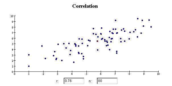
Correlation
and Association
Correlation is a measure of linear association: how nearly a scatterplot
follows a straight line. We say that two variables are positively correlated if the
scatterplot slopes upwards; they are negatively correlated if the scatterplot slopes
downward. The correlation coefficient for a scatterplot of Y versus X is always the same as the
correlation coefficient for a scatterplot of X versus Y. Note that linear association is not the only kind of association: some variables
are nonlinearly associated. For
example, the average monthly rainfall in Berkeley, CA, is associated with the month of the
year, but that association is nonlinear: it is a seasonal variation that runs in cycles.
Correlation does not measure nonlinear association, only linear association. The
correlation coefficient is appropriate only for quantitative variables, not ordinal or
categorical
variables, even if their values are numerical.
Correlation is a measure of association, not
causation. For example, the average height of people at maturity in the US has been
increasing. Similarly, there is evidence that the number of plant species is decreasing
with time. These two variables have a a negative correlation, but there is no
(straightforward) causal connection between them.
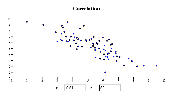
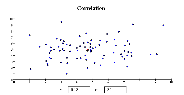
The correlation coefficient r is close to 1 if the data cluster tightly
around a straight line that slopes up from left to right. The correlation coefficient is
close to -1 if the data cluster tightly around a straight line that slopes down from left
to right. If the data do not cluster around a straight line, the correlation coefficient
r is close to zero, even if the variables
have a strong nonlinear association. Here are some examples of scatterplots that
have specific values of the correlation coefficient r.
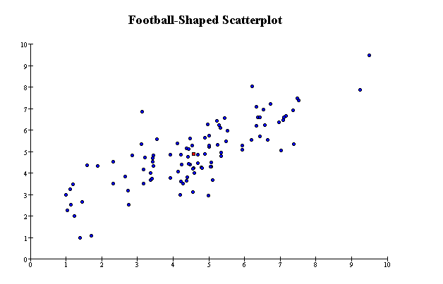
Linearity
The following scatterplot illustrates a linear relationship between the variables. The scatterplot is roughly football-shaped: the
points do not lie exactly on a line, but are scattered more-or-less evenly around one.
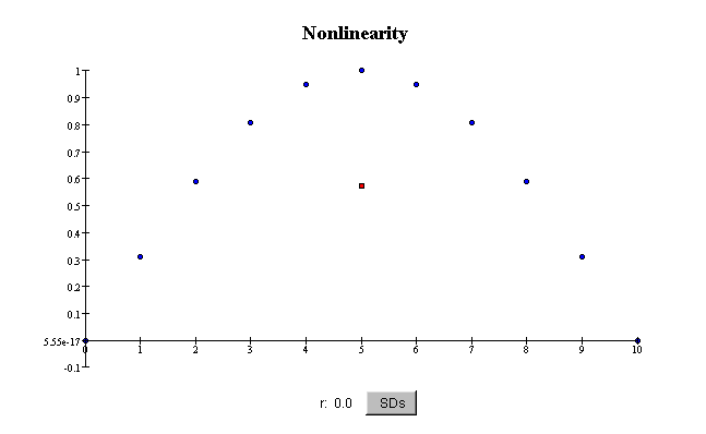
Nonlinearity
Some scatterplots show curved patterns. Such scatterplots are said to
show nonlinear association between
the two variables. The correlation coefficient
does not reflect nonlinear relationships between variables, only linear ones. For example,
even if the association is quite strong, if it is
nonlinear, the correlation coefficient r
can be small or zero:
In this plot, the scatter in X for a given value of Y is very small, so
the association is strong. Even though the
association is perfect, because you can predict Y exactly from X, the
correlation coefficient r is exactly zero.
This is because the association is nonlinear.
\
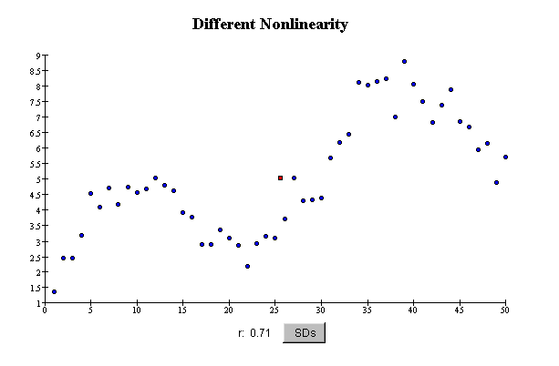
In this scatterplot, the pattern in the relationship between the variables is not a straight line---it is
curved. The data are scattered more-or-less evenly around a curve: the scatter in the values of Y is about the same for different
values of X, that is, in different vertical "slices" through the scatterplot.
The correlation coefficient is reasonably large
(0.71), because there is an overall trend in the data. However, the correlation
coefficient still does not show how strongly associated the variables are, because the
pattern of their relationship is curved. The correlation coefficient is not a good summary
of the association of these variables.
Assumption 2: The correlation coefficient
r measures only linear associations: how nearly the data
falls on a straight line. It is not
a good summary of the association if the scatterplot has a nonlinear
(curved) pattern.
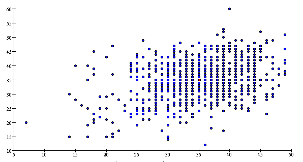
Homoscedasticity and Heteroscedasticity
Scatterplots in which the scatter in Y is about the same in different vertical slices are called homoscedastic (equal scatter).
Data are homoscedastic if the
SD in vertical slices through the
scatterplot is about the same, regardless of where you take the slice. Homoscedastic means
"same scatter." In contrast, if the vertical SD varies a great deal depending on
where you take the slice through the scatterplot, the data are heteroscedastic.
The SD is a measure of the scatter in the list. So
far, all the plots in this section have been homoscedastic. The next scatterplot shows heteroscedasticity: the scatter in vertical
slices depends on where you take the slice.
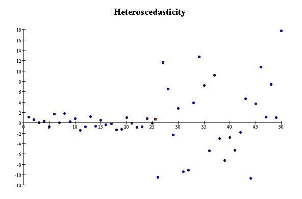
The scatter in a strip near the right of the plot is much larger than
the scatter in a strip near the left of the plot. There is not much association between Y
and X, but the correlation coefficient is still 0.15. This is an artifact of the
heteroscedasticity.
Assumption 3: The correlation coefficient r
is not a good summary of association if the data are
heteroscedastic.
Outliers
A point that does not fit the overall pattern of the data, or that is many SDs from the bulk of the data, is called an outlier. A single outlier that is far from the point of
averages can have a large effect on the correlation
coefficient. Here are two extreme examples of scatterplots with a large
outlier:
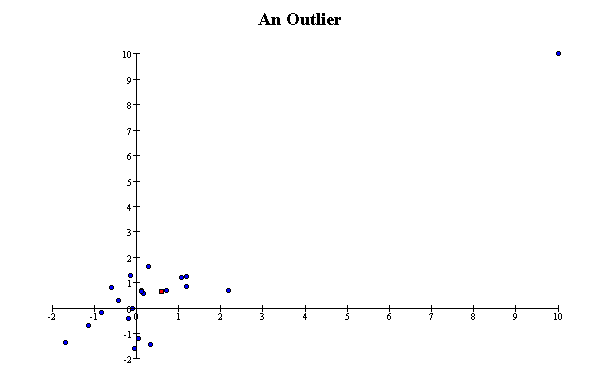
In the first, the outlier makes the
correlation coefficient nearly one; without it, the correlation coefficient would be
nearly zero.
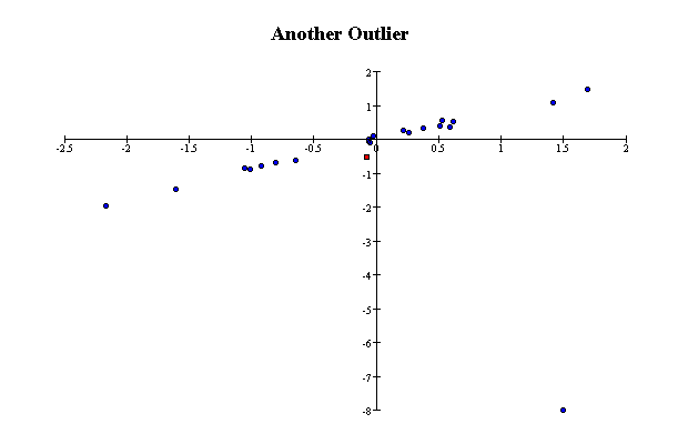
In the second, the outlier makes the correlation coefficient nearly zero;
without it, the correlation coefficient would be nearly one.
Assumption 4: The correlation coefficient r is not a good
summary of association if the data have outliers.