Normal
distribution curve:
graphs, formula, history
Normal Distribution Curve Formula
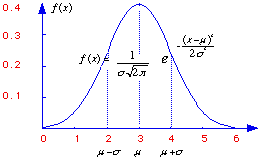
The normal distribution is a commonly occuring shape for population distributions. It shown by the above graph and has the following equation:
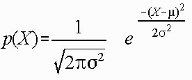
where:
e = constant
u = mean
o = standard deviation
On the graph, the X axis represents different values for X, and the Y axis is the density, or the frequency or probability of occurence of X.
History of the Normal Distribution
The normal distribution was originally studied by DeMoivre (1667-1754), who was curious about its use in predicting the probabilities in gambling. The first person to apply the normal distribution to social data was Adolph Quetelet (1796-1874). He collected data on the chest measurements of Scottish soldiers, and the heights of French soldiers, and found that they were normally distributed. His conclusion was that the mean was nature's ideal, and data on either side of the mean were a deviation from nature's ideal. Although his conclusion is arguable, he nonetheless represented normal distribution in a real-life setting.
Properties of the Normal Distribution Curve
All normal distribution curves are bell-shaped and bilaterally symmetrical. The tails of the curve approach the X-axis, but never touch it. Although the graph will go on indefinately, the area under the graph is considered to have a unit of 1.00.
Also unique about the normal distribution curve is that the mean, median, and mode are the same value.
When looking at any graph, you can estimate the mode and median by simply looking at a graph: the mode is the value with the highest frequency, and the median is the middle point. It is harder to estimate the mean, however, as that depends on the range of values. But, since they are equal in a normal distribution graph, the mode, median, and mean are the value with the highest frequency.
What if these three values did not equal each other? If mean < median < mode, the graph is negatively skewed: there are small outlier values. If mean > median > mode, the graph is positively skewed: there are large outlier values. What do you think these graphs would look like?
Parameters of the Normal Distribution Curve:
There are two parameters of the normal distribution curve equation: u and o. u is the mean of the sample, o is the standard deviation of the sample. For each different u and o, we will have a different distribution. But, if each distribution depends on its o and u, how can we compare different distributions? We would have to make a table for each and every possible u and o. To solve this problem, the normal distribution is converted to a standard normal distribution: a normal distribution with a mean of 0 and a standard deviation of 1.
How will these parameters affect the normal distribution graph? When u is large, the mean, median, and mode will be large. Therefore, the graph will be shifted along the X axis to large numbers. If o is large, the variance of the graph will be large, and the graph will be spread out along the X axis.
Standard Normal Distribution
Given that we know the distribution is normal, we can learn things about the data set. For example, if a distribution is normal, we know the percentiles of the data; given a normal distribution, 68% of the data will fall between +/- one standard deviation from the mean!
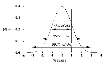
How would we learn the percentile of a specific data point? To do this, we would convert each data point to a z score, converting the whole distribution to a standard normal distribution (see above for description). A z score tells us how many standard deviations a data point is from the mean.
z = (data point - mean)/standard deviation
Z scores can also tell us what specific percentile a data point is in. For example, suppose a data point has a calculated z score of 1.43. What percentile would this data point be in? Well, given calculus, we know that the area under the curve between any two values is equvalent to the probability of that score appearing randomly in that interval. So, what is the area under the curve at 1.43 standard deviations away from the mean? Looking up in a table, we can see that a z score of 1.43 is equivalent to .0764. Or, 7% of the data fall from this point to the end of the graph. Hence, this data point is in the 7th percentile.