When dealing with correlations, it is sometimes easier to look at a visual representation of the concepts being examined. One useful visual technique is the scatterplot. Scatterplots are used to gain insight into the relationships between two continuous variables. The predictor variable is located on the x axis, while the criterion variable is located on the y axis. The criterion variable represents the behavior to be predicted. The predictor variable represents the activity which is believed to be associated with the criterion. The information from each subject represents one dot on the graph. Taken together, these dots form a regression line which shows the nature of the relationship between the predictor and criterion variables.
For example:
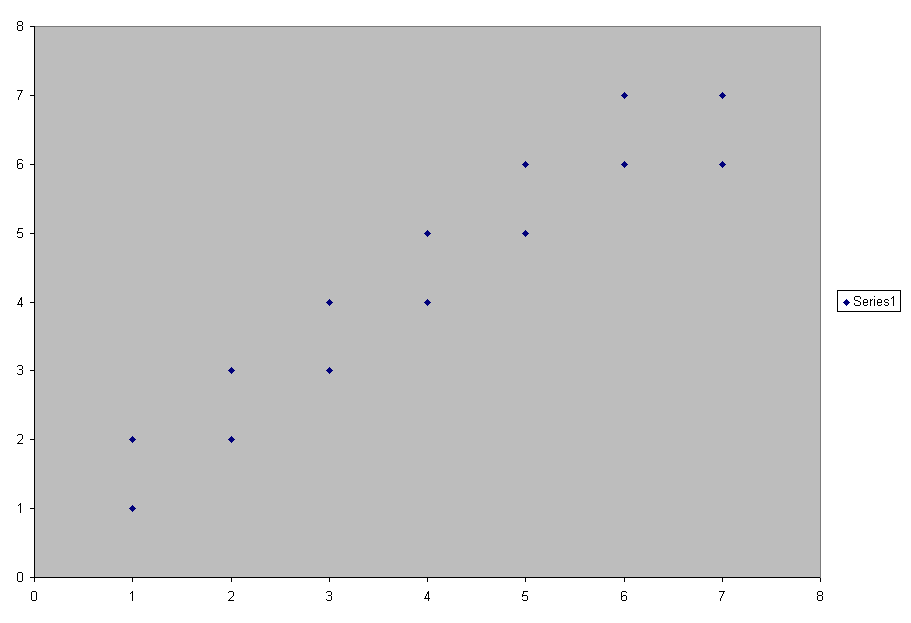
This scatterplot represents a positive relationship between the x and y variables. As the predictor variable increases, so does the criterion variable.
Here is another example:
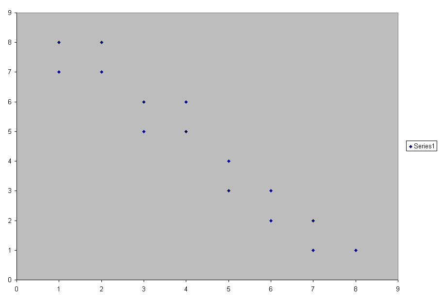
Here we see a negative relationship. As the predictor variable increases, the criterion variable decreases.